
How to Design Mobile Dashboards in Tableau like a Pro

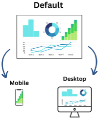
As data-leveraging tools grow more powerful than ever, so has our desire for quick and convenient access to insights. Tableau’s mobile layout feature allows users to quickly reference the data they need regardless of circumstance. Read along for several tips to seamlessly convert your existing Tableau dashboards to a mobile layout in a way that is digestible and powerful for your audience.
Why Mobile?
As an Intern, one of my projects this summer involved working with a client to adapt their dashboards to mobile in Tableau. The motivation behind the project was straightforward: they often found themselves on site visits trying to recall a metric but preferring not to go through the hassle of openning up their laptop mid-conversation. This created a need for their administrators to have quick access to key dashboards in any location.
Tableau’s mobile format allows you to get the most out of the dashboards that you or your team worked hard to build by making them quickly accessible. If you download the mobile app, Tableau also saves your mobile dashboards locally so that they are available offline. Wherever you are or whatever you are up to, you can access the report you need from your phone. This transition is additionally made easier with Tableau’s generation of pre-made mobile layouts that act as a framework to begin converting existing dashboards.
As I embarked on the Tableau mobile project, there were certainly some painstaking moments trying to determine the right process. While every dashboard is a bit different, I documented my takeaways as I learned how to move more quickly and effectively in hopes that it might help others, too.
I also sat down with Anwar Eaton, a UX Designer and Principal Consultant in Product Management at Moser, to get his recommendations on mobile design from a user interaction standpoint.
Tips for mobile design:
Tip 1: Follow steps to keep your existing dashboard in tact
Remember that a mobile layout isn’t independent of your existing report. One of the biggest things to keep in mind is that any visual you want to use in mobile must first exist in the ‘default’ view. Think of the default layout as your “base camp” for sheets and their associated items. They must start in the default layout before they reach their destination (mobile or desktop), and if they don’t exist in the default layout, they can’t exist in mobile.
As you move through your mobile design, keep in mind what actions will affect your desktop view. When adding or changing sheets and their associated components, always check your desktop version to be sure there are no unintended consequences.

Finally, follow this order of operations to minimize the need to flip back and forth to check your work:

Tip 2: Always keep the User in mind
As you convert your dashboards, remember to continuously ask yourself what a user might be doing or looking for in a situation where they call up a mobile report.
Let’s say you have a dashboard with ticketing information for an event. While a desktop version might provide organizers with a variety of metrics on attendees, maybe the primary mobile user only needs an updated headcount while at the venue. You don’t want to waste their time with additional information.
To address this Anwar, in UX, suggests always speaking with the client in advance to get a sense of what they are trying to achieve with the adaptation of a mobile layout. There is always a tradeoff when shifting from your primary layout to a secondary experience for users, so it is essential that you understand what is non-negotiable in this shift.
Accessibility and ease of use is also a huge consideration in User Interaction. While tableau reports can’t be as dynamic as applications, try to get to know how your audience interacts with your report and address any issues that they may encounter. Send out a System Usability Scale https://www.usability.gov/how-to-and-tools/methods/system-usability-scale.html or other survey to get feedback on problem areas. Sit down with participants and conduct a Think-Aloud https://www.nngroup.com/articles/thinking-aloud-the-1-usability-tool/ to determine where they get stuck and collect their general thoughts as they move through the dashboard.
Tip 3: Keep down the clutter
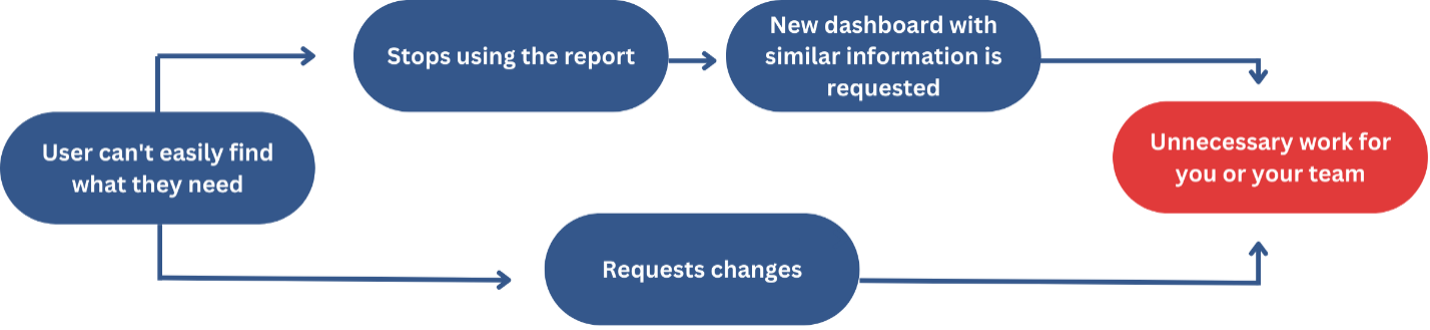
Since a mobile screen is considerably smaller than a desktop screen, it is essential to take steps to condense and properly format your flow of information. From a UI standpoint, padding the page with too much information puts you at risk of overwhelming the user. When a user can’t immediately find what they need or quickly understand how to find it, they are more likely to ask for additional changes to the report- or to simply stop using it.
To avoid putting dashboards at risk of going out of commission, do your best to keep the user’s view simple and understandable. There are a few ways you can do this:
Use show/hide buttons to keep extra objects out of the initial view:
If you have more than a couple of filters or a large item that isn’t immediately necessary, allow users to hide them from view or open them when entering the report. When doing so, always make sure icons are very clear as to what they are showing and hiding. UI designers abide by the concept of “Skeuomorphism,” the design principle that buttons should resemble their real-world counterparts. If you don’t have space to write “show filters,” for example, put an image of a filter rather than a simple drop-down arrow. Doing so prevents users from clicking exploratorily, which leads to frustration and diminishes the overall usability of your report.Simplify visuals:
Since the mobile layout has less real estate, don’t try to condense a large visual into a small space and risk losing the clarity of your visual. Instead, play around with the orientation and sizing to ensure users can easily find what they are looking for. This will be highly subjective – so take time with your team to brainstorm best practices or choose between options. My client often opted for bolded KPIs above visuals so that users were more likely to immediately find what they were looking for, as well as horizontal-oriented bar charts so that users can read left to right.Don’t try to do it all:
Remember that your mobile report is simply an adaptation of the original. After all, if we could do it all on mobile, why would we have desktops? Don’t be afraid to have a conversation with the client or user about what might not be necessary and can be cut out. Once that aspect is omitted from the report, include a disclaimer that it is not available in the mobile version.
In keeping these three tips in mind throughout your mobile adaptation process, you’ll move more effectively through your designs and ensure your dashboards provide as much value as possible to users.
Happy designing!
If your company wants a consult on your Data or you are interested in getting more information on Dashboards (Mobile and PC) contact Moser’s Data & Analytics Division to increase your company’s efficiency, productivity and product ROI.